2023 Health Value Dashboard Frequently Asked Questions (FAQ)
General questions
1. What is the Health Value Dashboard?
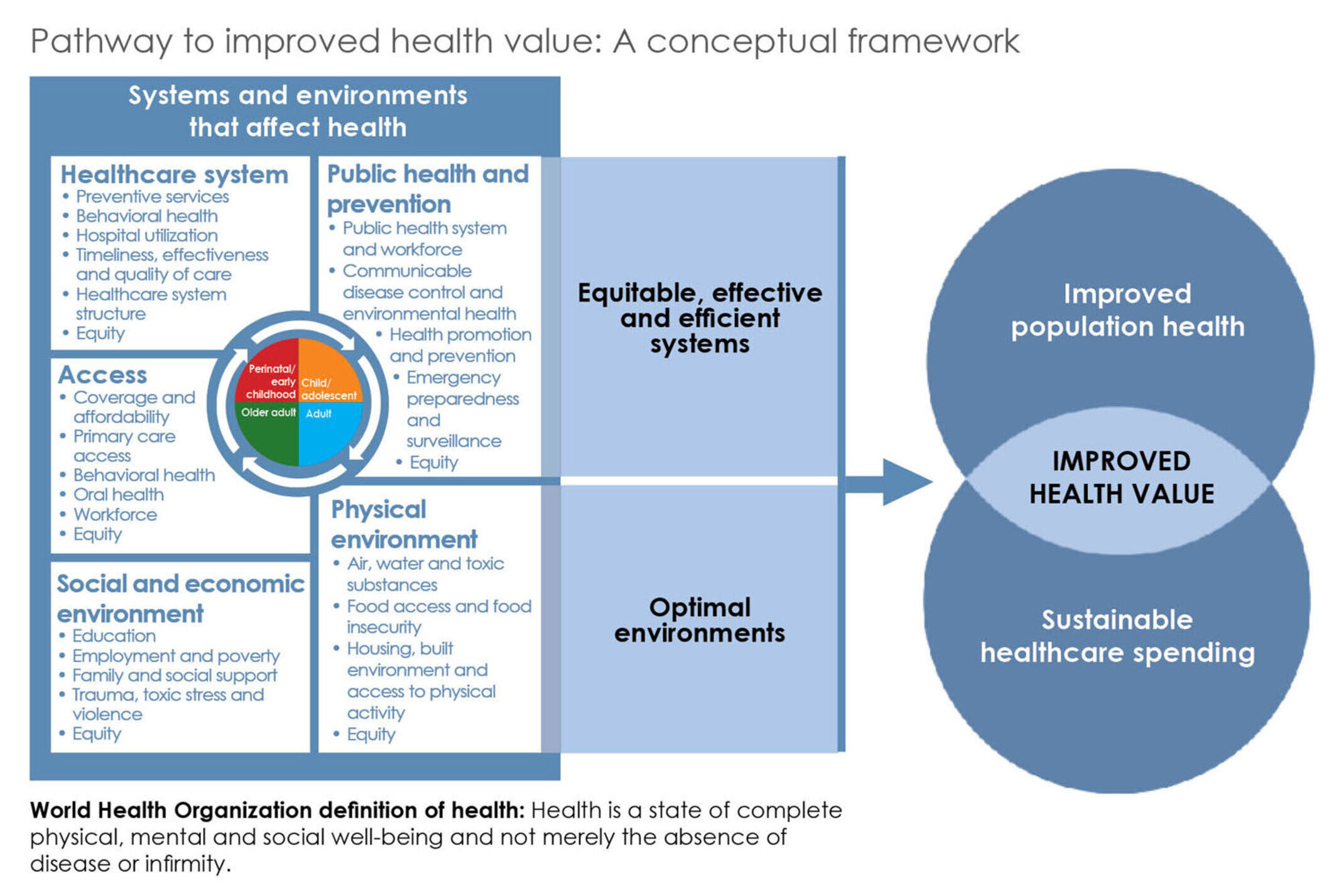
The Health Policy Institute of Ohio’s Health Value Dashboard™ is a tool to track Ohio’s progress toward health value — a composite measure of Ohio’s performance on population health outcomes and healthcare spending. The Dashboard examines Ohio’s rank and trend performance relative to other states across seven categories (referred to as “domains”): population health, healthcare spending, access to care, healthcare system, public health and prevention, social and economic environment and physical environment. In addition, through a series of equity profiles, the Dashboard highlights gaps in outcomes for groups of Ohioans who are systematically disadvantaged.
The Dashboard is based on the Pathway to Improved Health Value conceptual framework (below), created in 2013 with input from HPIO’s Health Value Dashboard Advisory Group. The framework defines health value and outlines the systems and environments that affect health. The Dashboard includes metrics related to these various systems and environments, including access to care, healthcare system performance, public health and prevention, social and economic environment and physical environment.
The 2023 Health Value Dashboard is the fifth edition of this publication. HPIO released previous editions in 2014, 2017, 2019 and 2021. HPIO is committed to updating the Dashboard on a biennial basis to align with Ohio’s biennial state operating budget process.
2. Why does HPIO produce the Dashboard?
Improving health and addressing healthcare spending growth are concerns shared by state policymakers and others and many Ohioans face barriers to being healthy. Collecting and sharing publicly available data on health, spending and the drivers of health provides an important starting place to understand Ohio’s performance relative to other states. The Dashboard also highlights evidence-informed policies that can be implemented at the state and local levels to address Ohio’s health challenges and achieve health equity.
3. How was the Dashboard initially developed?
Since 2013, HPIO has convened the Health Value Dashboard Advisory Group (formerly called the Health Measurement Advisory Group) to advise development of and revisions to the Health Value Dashboard. The Advisory Group includes stakeholders from a wide array of sectors throughout Ohio.
In 2013-2014, the group advised HPIO on the development of the Pathway to Improved Health Value conceptual framework upon which the Dashboard is based. For each edition of the Dashboard, members of the advisory group have served on workgroups to inform metric selection and updates and advised on layout, methodology and equity components. HPIO’s Equity Advisory Group has provided feedback on the equity profiles and equity components of the Dashboard.
Since 2017, HPIO has contracted with researchers at the Voinovich School of Leadership and Public Affairs at Ohio University to assist in analysis and ranking.
4. How does the 2023 Dashboard compare to the 2021 Dashboard?
Most metrics in the domain profiles of the 2023 edition (93%) are the same or similar to the 2021 edition. Of 110 metrics in the 2023 Dashboard, 96 are the same or similar, 6 are revised and 8 are new or replacements for metrics that were modified, discontinued or not updated by the source used for the 2021 Dashboard.
The 2023 Dashboard:
- Maintains consistency in methodology for ranking and trend
- Adds new equity profile content, including a progress toward equity section and an LGBTQ+ profile
- Adds two COVID-19 metrics, COVID-19 mortality in the population health domain and COVID-19 vaccinations in the public health and prevention domain
- Adds four new metrics to address drivers of healthcare spending, which are included in the healthcare system structure sub-domain of the healthcare system domain
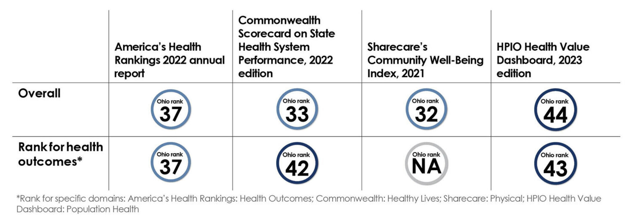
5. How is the Dashboard different from other scorecards and rankings that are out there?
Unlike other health scorecards, the HPIO Dashboard places a heavy emphasis on the sustainability of healthcare spending, a critical component of any policy discussion on improving health, but one that often is not included on state rankings. In fact, as far as we know, the Health Policy Institute of Ohio was the first in the nation to develop a state ranking of “health value,” placing equal emphasis on population health outcomes and healthcare spending. The Dashboard also provides a more comprehensive look at other factors that impact population health outcomes and healthcare spending. It addresses the wide range of factors, such as a state’s social, economic and physical environment, that contribute to health value.
Ohio’s rank on health outcomes is similar across scorecards listed below:
Questions about correlations, metrics and methodology
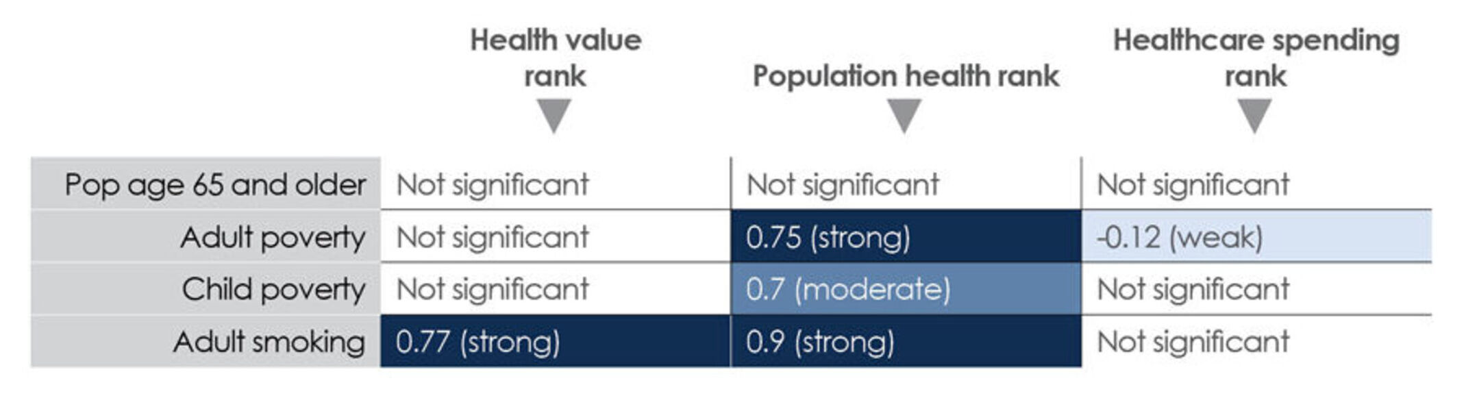
6. How are age, poverty and other factors correlated with a state’s rank on health value, population health and healthcare spending?
HPIO ran a series of correlation analyses to determine the strength of relationships between specific factors and health value rank, population health rank and healthcare spending rank (displayed in the table). HPIO generally considers a correlation with a correlation coefficient (r) of 0.75 or higher to be strong, 0.5 – 0.75 to be moderate and below 0.5 to be weak. However, even a strong correlation does not suggest a causal relationship.
The correlation between percent of a state’s population age 65 and older and ranks for health value, population health and healthcare spending were not significant. This means that states with a higher percentage of the population age 65 and older do not necessarily have worse health value, worse health outcomes or higher healthcare spending (measured on a per-person basis).
Child and adult poverty, however, did correlate with population health rank, indicating that poverty plays a role in driving health outcomes. Adult smoking was strongly correlated with population health and health value. Consistent with every past edition of the Health Value Dashboard, this finding highlights the importance of reducing tobacco use to improve health value.
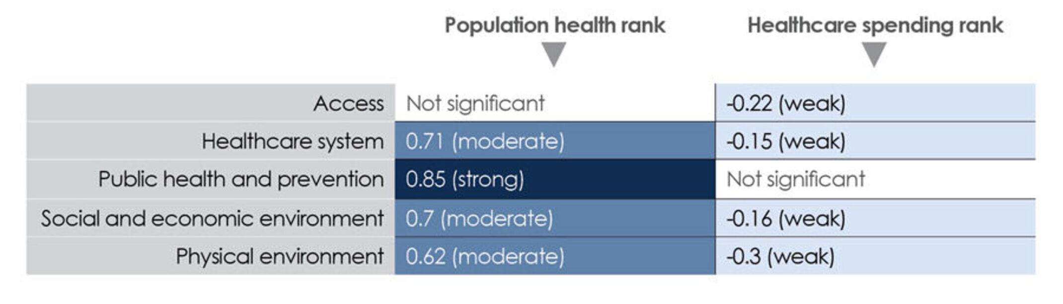
7. Which domains most strongly correlate with population health and healthcare spending ranks?
The public health and prevention domain was strongly correlated with population health, while healthcare system, social and economic environment and physical environment were moderately correlated with population health. Correlations between most domains and healthcare spending rank were weak and negative, indicating a weak inverse relationship between performance on the access, healthcare system, social and economic environment and physical environment domains and healthcare spending.
8. How many metrics are in the Dashboard and where does the data come from?
- There are 110 metrics in the domain profiles of the 2023 Dashboard. Of these, 106 are ranked. Metrics with more than 10 missing states were not ranked. Some metrics were also not ranked because the data could not be compared across states or desired direction could not be identified.
- There are 42 metrics in the equity profiles and/or equity appendix. HPIO disaggregated these metrics by race and ethnicity, educational attainment, income, sexual orientation, gender identity and/or disability status depending on data availability. Thirty-one metrics were disaggregated by race and ethnicity, 17 by education and/or income, 13 by disability status and 13 by sexual orientation and/or gender identity.
- All Dashboard data comes from public sources. Most of the data used in the Dashboard was obtained without a data request. Some data was obtained from state agencies. The 2023 Dashboard includes data from 77 unique sources. See the data appendices for additional source information.
9. Where can I find information about metrics (e.g., sources, years, descriptions)?
See the data appendices for information about individual metrics in the ranked and equity profiles.
10. Where can I find more information about the methodologies/methods used in the Dashboard?
See the Dashboard process and methodology document for more information, including:
- Information about the Health Policy Institute of Ohio and the history of the Health Value Dashboard
- Metric selection process
- Data gaps and limitations
- Ranking and trend methodology
- Methodology for assessing health disparities and inequities
11. How do I interpret disparity ratios?
Disparity ratios displayed in the 2023 Dashboard equity profiles were calculated by dividing the outcome (e.g., rate or percent) of comparison groups (i.e., groups that consistently experience worse outcomes and are systematically disadvantaged) by the outcome of the reference group (i.e., the group that most consistently experiences the best outcomes and is systematically advantaged). For example, the unemployment rate for Black Ohioans (comparison group) is 10.6%. The unemployment rate for white Ohioans (reference group) is 4.3%. The Black-white disparity ratio for unemployment is 2.5. This means that the unemployment rate for Black Ohioans is 2.5 times higher than the unemployment rate for white Ohioans.
Questions about the COVID-19 pandemic
12. How did the pandemic affect data availability and quality?
HPIO compiled the most recently available data for the Dashboard. In most cases (75% of metrics), the most-recent data presented in the domain profiles is from 2020 or later, meaning that it captured the time period after the pandemic was declared. However, some data was only available for 2019 or earlier. The table below describes the number of metrics in the Dashboard, by recency of data and by domain:
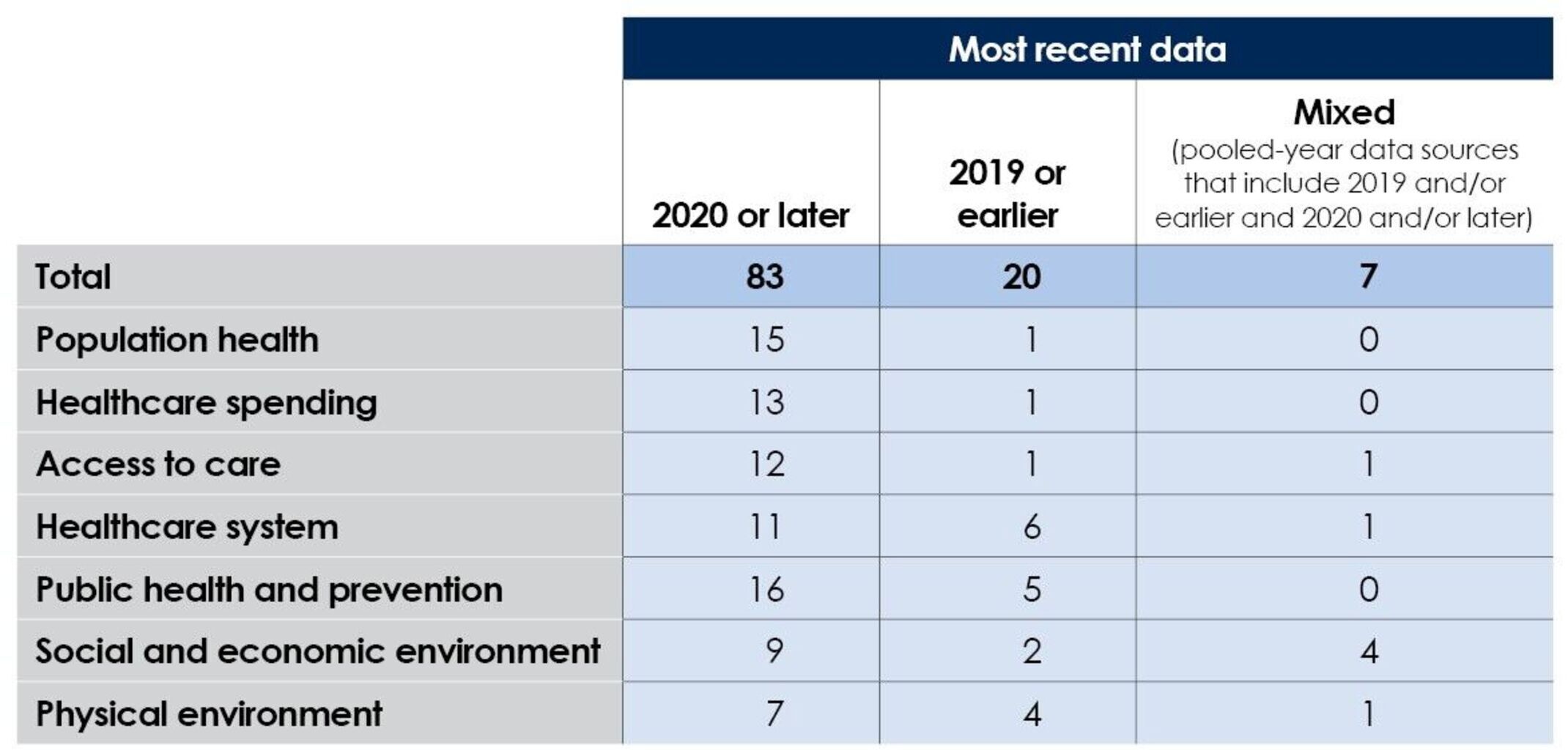
The COVID-19 pandemic had a significant impact on data collection, reporting and quality, resulting in some metrics not being updated with more recent data. Also, 33% of metrics were missing one or more states, compared to 6% in 2021, likely due to pandemic disruptions in data collection and reporting. HPIO took steps to thoroughly vet and report only the highest quality publicly available measures, reporting data from pre-pandemic years when the estimates from more recent years were unstable or contained fluctuations in reporting. For more information, see the Dashboard process and methodology.
13. What changes to the Dashboard did HPIO make in response to the pandemic?
HPIO added two new metrics specific to COVID-19:
- COVID-19 mortality. Number of deaths from COVID-19 per 100,000 population since January 21, 2020 (data current as of December 27, 2022). Added to the population health domain.
- COVID–19 vaccinations. Percent of the total population that has received the primary series of the COVID-19 vaccination (as of October 20, 2022). Added to the public health and prevention domain.
In addition, pages 25-26 of the Dashboard describes the impact of COVID-19 on health value.
Questions about 2023 Dashboard findings
14. Where does Ohio rank?
- Ohio ranks 44 out of 50 states and the District of Columbia (D.C.) on health value. This means that Ohioans are living less healthy lives and spending more on health care than people in most other states.
- Ohio ranks in the bottom quartile on 28.3% of ranked metrics and in the top quartile on 8.5% of ranked metrics.
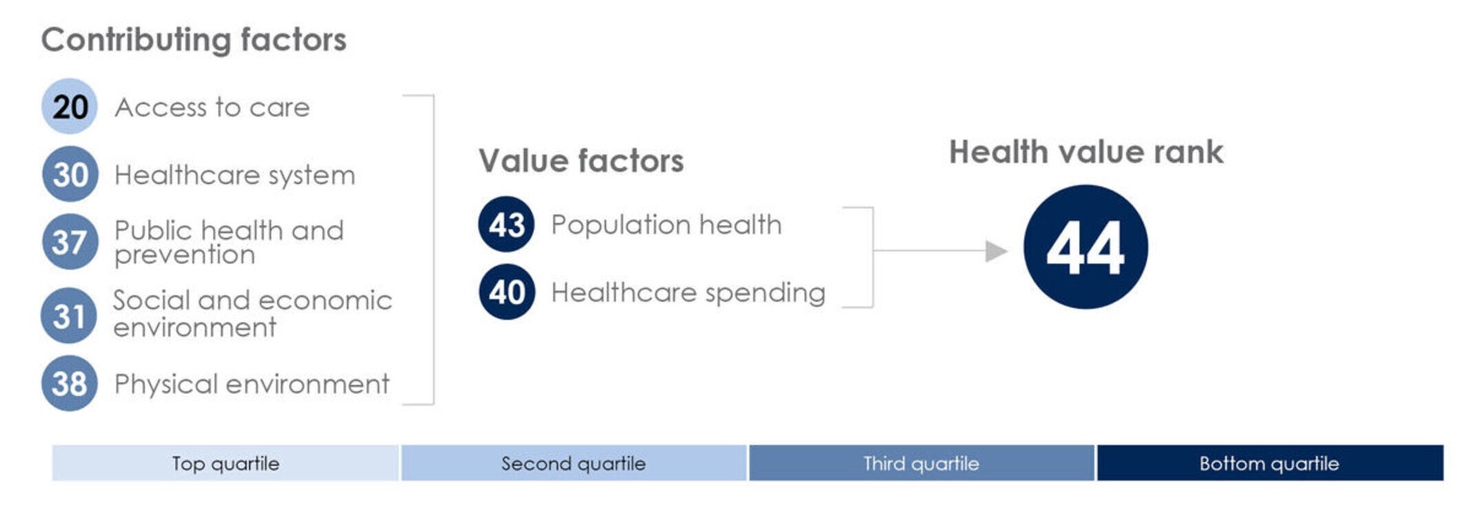
15. How is Ohio’s health value rank determined?
- Health value is calculated by equally weighting population health and healthcare spending metrics. The diagram below shows Ohio’s rank on the value factor domains (population health and healthcare spending), which are combined to calculate Ohio’s rank on health value.
- The Dashboard also includes ranks for the contributing factor domains (access to care, healthcare system, public health and prevention, social and economic environment and physical environment). The diagram below shows Ohio’s rank on these domains.
- The contributing factor domain ranks are not included in the calculation of the health value rank. Rather, the contributing factor domain ranks provide information about how Ohio performs compared to other states on a wide range of factors that are relevant to health outcomes and healthcare spending.
16. Did Ohio improve?
- Ohio’s health value rank is 44 in the 2023 edition. Ohio’s rank in the 2021 edition was 47. Because the metrics that go into the health value rank have changed in each edition, caution should be taken when comparing Ohio’s health value rank across editions.
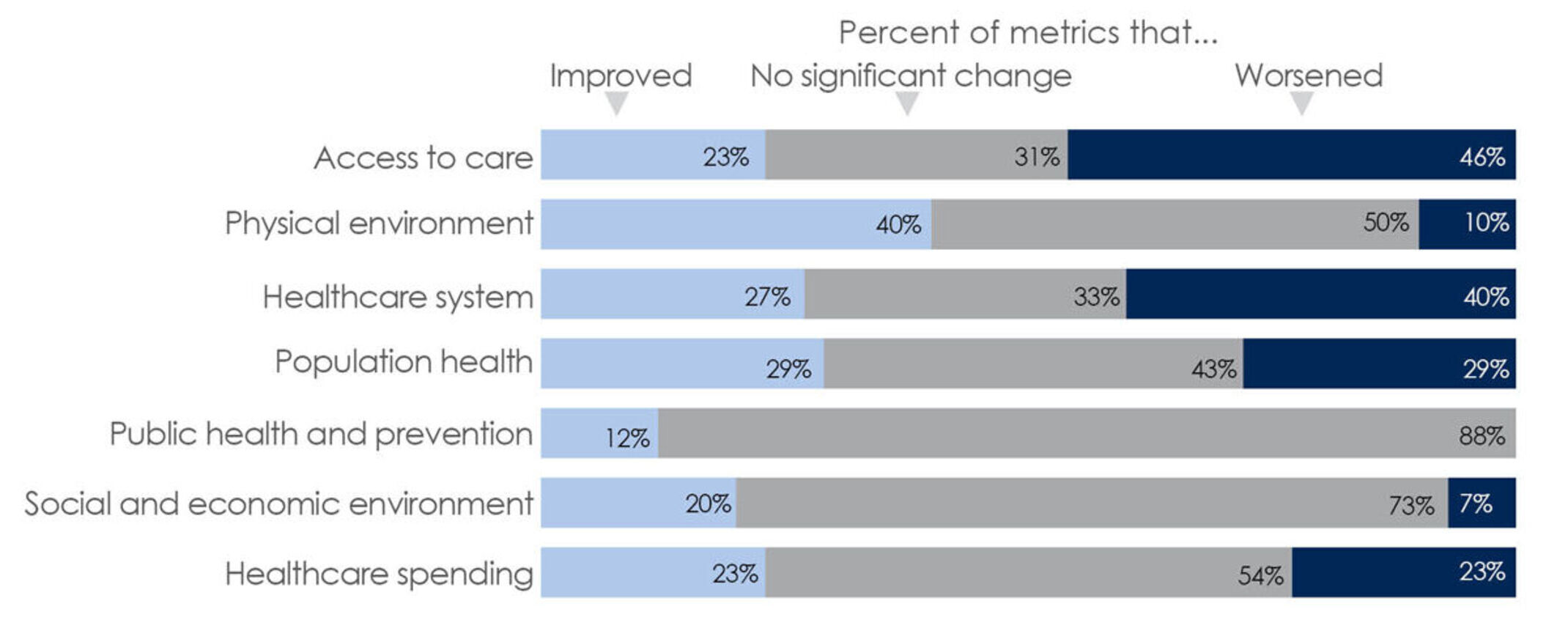
- Looking at trend over time relative to other states across all metrics in the Dashboard, Ohio saw more improvement than worsening (See question 19 for information about trend analysis).
- As shown in the graphic below, the physical environment domain had the highest proportion of metrics that improved, while the access to care domain had the highest proportion of metrics that worsened.
17. What are the regional differences across states?
There are some notable regional patterns in rankings:
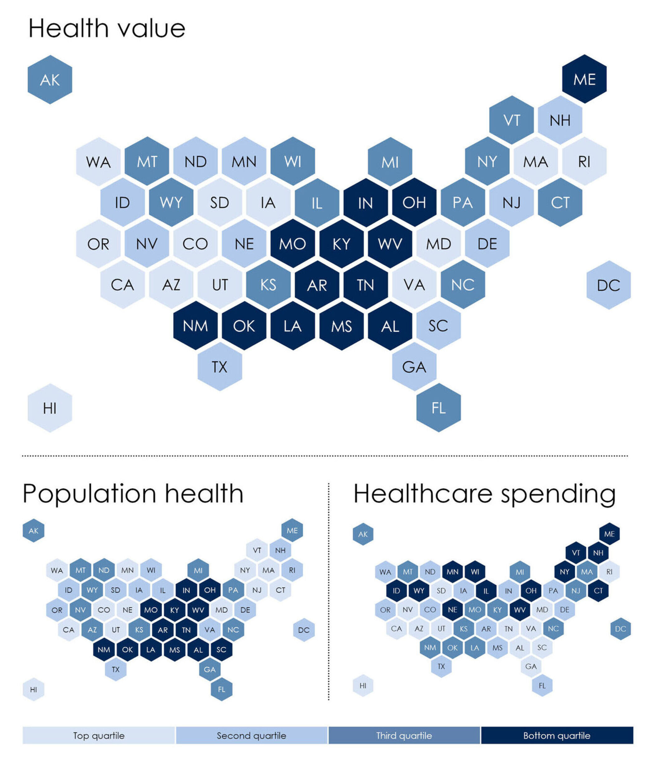
- The pattern for population health and health value rank is similar, with bottom quartile states clustered in the south and Midwest, plus Maine. States with the best population health are located in the northeast and west.
- All states in the bottom quartile for spending (indicating higher spending) are in the northern half of the country, while states in the top quartile for spending (indicating lower spending) are clustered in the west and southeast, plus Rhode Island.
- Ohio and West Virginia are the only states ranked in the bottom quartile for both population health and health value.
- Four states are in the top quartile for both population health and healthcare spending: Hawaii, Utah, California and Maryland.
18. Which states had the most improvement?
The four states that improved on the highest percent of metrics from baseline to most recent year were: South Carolina (33.0%), the District of Columbia (32.6%), Nevada (29.5%) and Oklahoma (28.9%).
19. How does HPIO calculate trend?
Trends are measured by looking at state performance over the three most recent years of available data, not by comparing ranks from one edition of the Dashboard to the next. HPIO’s trend methodology compares a state’s absolute change on a metric from baseline to most recent year to the standard deviation of all state’s values for the three most recent years. This methodology is consistent with the approach used in the Commonwealth Fund’s Scorecard on State Health System Performance. For more information, see the methodology.
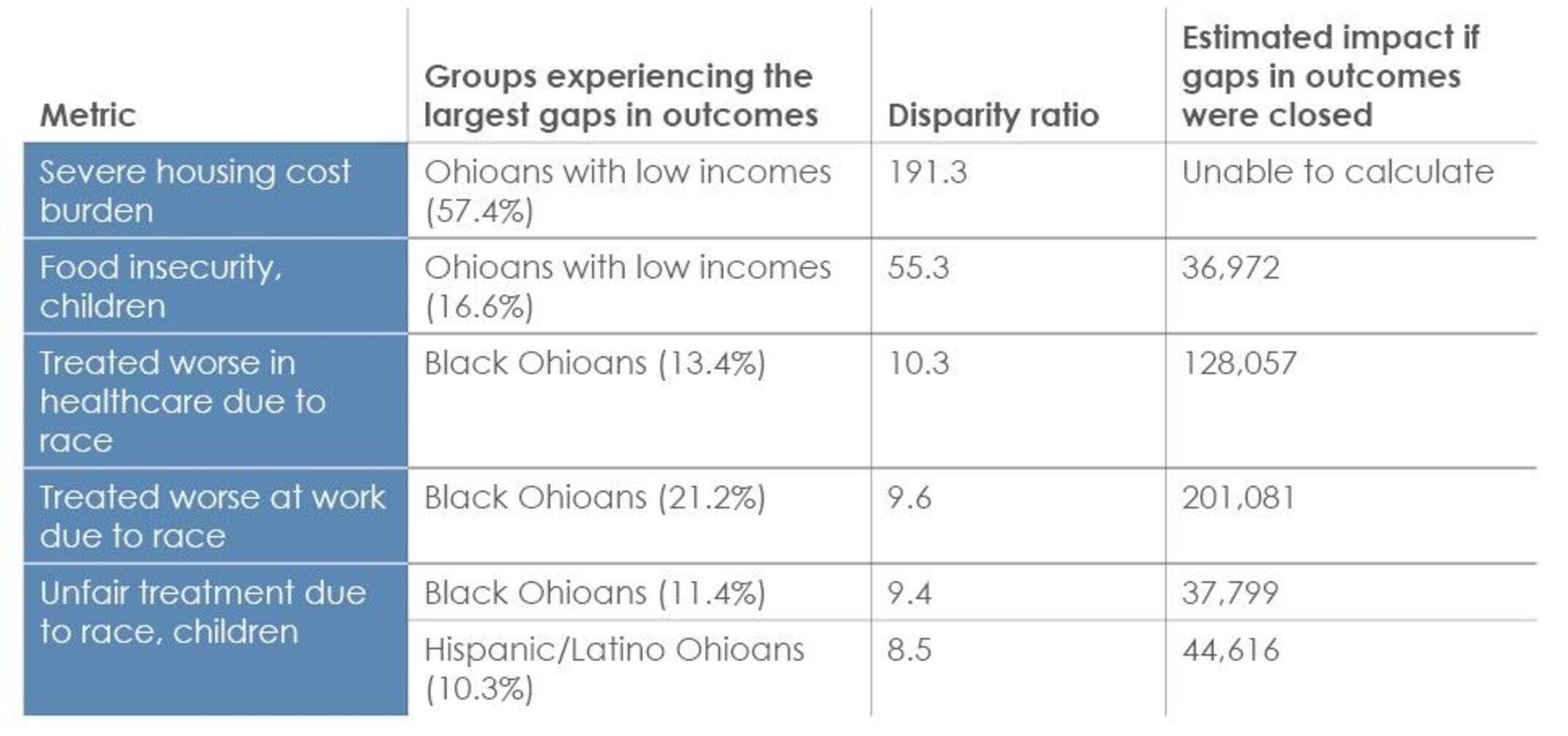
20. Which metrics had the largest disparity ratios across the equity profiles?
The following metrics had the largest disparity ratios in the equity profiles:
Top five metrics with the largest gaps in outcomes
21. Why does the Health Value Dashboard use metrics from the National Health Security Preparedness Index (NHSPI) instead of the Trust For America’s Health Ready or Not report?
The National Health Security Preparedness Index (NHSPI) is a tool for measuring the national, state, and local capability for protecting people from the health consequences of large-scale hazardous events. The 2021 Index combines 130 measures from 64 sources, providing overall and domain scores for all states and the District of Columbia. NHSPHI is a program of the Robert Wood Johnson Foundation that is currently based at the University of Colorado.
The Trust for America’s Health (TFAH) Ready or Not annual reports also provide information about state performance on health security and emergency preparedness. TFAH’s report focuses on a much smaller subset of measures from NHSPHI to spotlight specific improvement goals. The 2023 TFAH report (released March 2023) categorizes state performance into three tiers based on 10 indicators. It is not possible to rank states based on the TFAH report due to the use of three tiers, rather than specific state scores.
In contrast, NHSPHI provides a robust and comprehensive picture of state performance, including state scores on specific domains that can be ranked.
In the 2019, 2021 and 2023 editions of the Health Value Dashboard, the public health and prevention domain has included two metrics derived from the NHSPHI: environmental and occupational health, and health security surveillance. These composite metrics are domains from the NHSPHI that were selected for the Dashboard because they are largely the responsibility of the state and local governmental public health system and contribute to a comprehensive description of state performance on foundational public health services.
The environmental and occupational health domain score draws upon 27 measures to describe state performance on actions to maintain the security and safety of water and food supplies, to test for hazards and contaminants in the environment, and to protect workers and emergency responders from health hazards while on the job. The health security surveillance domain score draws upon 31 measures to describe state performance on actions to monitor and detect health threats, and to identify where hazards start and spread so that they can be contained rapidly.
Questions about strategies to improve health value
22. How can we improve health value in Ohio?
The 2023 Dashboard highlights three key approaches to improve health value, including several specific strategies with strong evidence of effectiveness for state policymakers. Research indicates that these policies and programs are likely to decrease disparities, improve outcomes and, in some cases, have demonstrated to be cost effective or cost saving. Page 4 of the 2023 Dashboard has a list of the strategies. See question 23 for additional details.
23. How did HPIO prioritize the strategies highlighted in the 2023 Dashboard?
There are many effective strategies to improve health and control healthcare spending. The nine example strategies in the 2023 Dashboard are not an exhaustive list. HPIO used the following criteria to prioritize an actionable and relevant set of strategies to elevate in the 2023 Dashboard:
- Relevance. Strategies relevant to the three ways Ohio can improve performance on health value, as identified in the 2023 Dashboard (strengthen Ohio’s workforce, foster mental well-being and improve healthcare effectiveness), including relevance to the strengths Ohio can build upon (economic renewal, mental health and addiction treatment infrastructure, access to care).
- Strength of evidence. The Dashboard elevates strategies with strong evidence of effectiveness as rated in evidence registries, such as What Works for Health and other topic-specific sources. There is evidence that the policy reduces disparities or inequities or creates structural change to advance equity, including strategies elevated in HPIO publications and state plans with a focus on eliminating disparities, such as the HPIO referred to the disparity ratings in What Works for Health to identify programs and policies most likely to achieve equity.
- Equity. There is evidence that the policy reduces disparities or inequities or creates structural change to advance equity, including strategies elevated in HPIO publications and state plans with a focus on eliminating disparities, such as the Social Drivers of Infant Mortality: Recommendations for Action and Accountability in Ohio. HPIO referred to the disparity ratings in What Works for Health to identify programs and policies most likely to achieve equity.
- Momentum and alignment. Strategies with momentum in Ohio’s legislature, priorities of Gov. DeWine’s administration and initiatives with strong advocacy efforts underway, as well as strategies in state plans, such as the State Health Improvement Plan and Strategic Action Plan on Aging, and HPIO publications with advisory group input.
- Policy and structural change. Policy, structural and systemic changes that can be acted on by state and/or local policymakers were prioritized over specific programs or services.
- Clarity. Strategies that are easily explained and defined.
- Potential impact. Strategies that are being considered in the current policy landscape in Ohio but have not been fully implemented and would benefit from additional attention from an independent organization such as HPIO.
- New perspectives. Rather than repeat many of the same approaches from past editions of the Dashboard, priority was given to highlighting strategies not addressed in previous editions.